
don’t cut corners on the core of your business identity.
By Roy Harryman
And now, a word about logos.
There’s a lot at stake in these seemingly simple designs. This is why a logo, like many specialized tasks (HVAC, business taxes, network security), is best left to professionals. Graphic design may seem like a “soft” science. Maybe it is. But it still matters to your business.
Modern logos are distant relatives of cattle branding. In the Old West, a hot iron left an impression on a cow that said, “Triple Bar Ranch.” This kept your livestock from getting confused with those belonging to others. Without it, how could you tell whose cow was whose?

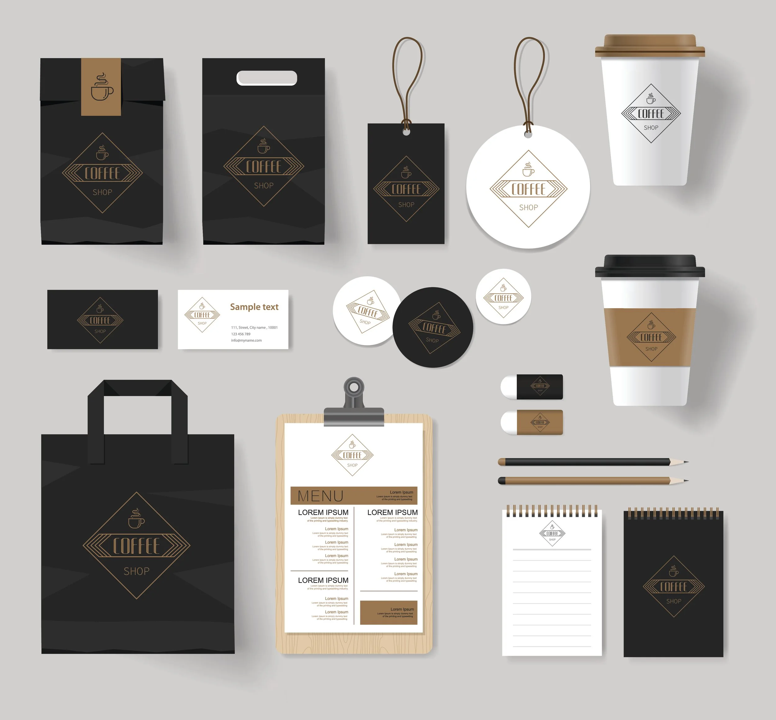
Our purposes today are different, but the concept is similar. The logo has been substituted for a hot iron. This icon is placed on storefronts, stickers, clothing, billboards, social media, your website and more. Its purpose is to be a distinguishing mark.
How big is a logo? It’s probably less than an inch wide on a business card. But put it on a banner – or even a billboard – and it’s ginormous. The fact that it will represent your company in ways large and small should be the first clue to its importance.
“Consider the weight a logo carries. A single image is intended to convey the essence of your entire business. That’s a lot of responsibility for a logo – especially since many contain only symbols and no words.”
A logo will undoubtedly be part of a prospect’s first impression. Will it be positive or negative?
Logo or “McLogo”?
The purpose of a logo is to provide an instant, memorable, aesthetic representation of your brand. Most non-designers do not have the skills to pull this off. Yes, you can get a logo for $5 online. You can also “create” a logo through Canva or some other DIY design website. But just because you can does not mean you should.
There is far more to the science of logo design than whether we personally like the logo. After all, the logo isn’t ultimately for you, right? It’s for your customers and prospects.
I’ve yet to see an effective logo created on the cheap. These “bargain” logos miss an opportunity to create a visual identity that reflects your unique business.
The science behind visual branding
First, logos require a knowledge of typography – a science in and of itself. Fonts matter, not only in terms of readability, but in the message they subconsciously convey. Logo design also requires education in the science of color. Therefore, our logo decisions should not be a matter of purely subjective preferences (“I love red!”). Colors communicate information to our brains, both consciously and subconsciously:
Green communicates environmental preservation and organic practices.
Blue is the color of many financial institutions because it communicates stability.
Yellow and orange are safety colors (vests, helmets).
Red is the traditional “look out!” color of fire engines.
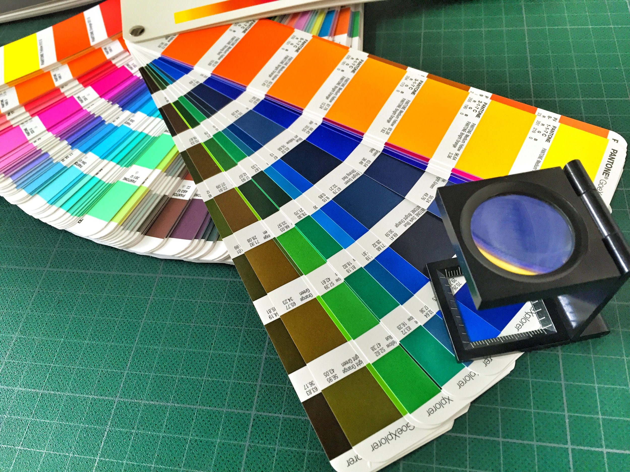
There’s a reason traffic signs aren’t pink, day care centers aren’t painted black, and women’s brands often (but not always) use pastels.
In addition, the color of the logo should complement any color scheme your organization already has. If your store or vehicles are intentionally yellow, then your logo should complement that choice.
Is it worth it?
There are infamous stories about governments and corporations spending six figures and more on logos. Rest assured: This is not necessary for a small business.
I hesitate to list specific prices here because the market fluctuates and there are many “it depends” factors. But your cost – depending on how much work you are asking for – can run from a few hundred to a few thousand dollars. And of course, you can pay an outrageous amount for anything if you’re not careful.
“Remember, you are paying for a distinct representation of your brand that will be displayed on sizes ranging from a pen to a billboard. How much is that worth to you?”
A logo isn’t something that is changed every two years. The goal is to create a consistent, memorable representation of your business that contributes to revenue generation.
There are also technical considerations to logo design. A logo created for large-format printing (a vehicle wrap, a billboard, a sign) must be created with software that uses vector art. However, most graphic design software creates raster art. Vector is line-based while raster is pixel-based. If you send the printer the wrong type of image, it will be rejected as unusable.
If you have to choose between using a free, do-it-yourself logo and having no logo, my counsel would be to skip the logo until you have the money. You can certainly do business without a logo, and it’s better to wait than to promote yourself with half-baked clipart.
Your brand’s visual identity should represent and complement the excellence of your core business. A logo is too important to “cheap out.”
GUIDED BY STYLE
P.S. The core of your professional branded identity is a logo. But it doesn’t stand alone. Businesses don’t create a new logo every year because they want clients and prospects to recognize their brand. That requires consistency – hence one logo. Yet a logo is surrounded by colors, whether it’s placed on a printed piece, a website or social media. In addition, all text about your business or nonprofit is conveyed through fonts. Like a logo, a consistent set of colors and fonts help the public recognize your brand.
The creation of a set of standard colors and fonts is called a style guide. This design framework provides professionalism, consistency and saves time and money. Without a style guide, you have to hope creative sparks fly every time you sit down to design a marketing piece. In essence, you’re staring at a blank canvas, waiting for inspiration to strike. This approach requires a great deal of time and energy because starting anything requires an extra oomph of energy and concentration.
When you use a style guide, however, many decisions are made for you at the outset. You select complementary colors from a palette and your font options are limited to no more than three (a headline font, a subheading font and a paragraph font). Professional graphic designers understand there is a science behind typography that is more significant than our own personal preferences. Well-meaning amateurs often err by using a whimsical, playful font when the business is of a much more serious category. For example, accountants and lawyers don’t need a “fun” vibe. In addition, fonts need to be legible. Intricate, cursive or bold fonts – called display fonts – are intended for limited use and not for paragraphs of text. A style guide keeps creativity within guardrails and complements the logo at the center of your visual brand identity.
ABOUT ROY HARRYMAN

Roy Harryman is the author of “Small Business, Big Impact: A No-Nonsense Marketing Strategy For Companies That Do More With Less.” This column is an excerpt from the book.